Positive Negative
-Nice house style. -Need faces and '2014' not overlapped.
-Good use of different fonts. -Over crowded.
-Like the top banner, good use of fonts. -Can't read the red on white well.
-Name of magazine. -White and red hard to read.
-Good use of different fonts. -Over crowded.
-Like the top banner, good use of fonts. -Can't read the red on white well.
-Name of magazine. -White and red hard to read.
-Colour Scheme. -Put photo over 'watch out' story.
-Interesting language. -Feels cluttered.
-Lots of text and stories. -'Watch out' bit shouldn't overlap artists face.
-Interesting language. -Feels cluttered.
-Lots of text and stories. -'Watch out' bit shouldn't overlap artists face.
-Title and top banner are really good. -Too much white behind photo.
-I really like the layout. -Photo is bad quality.
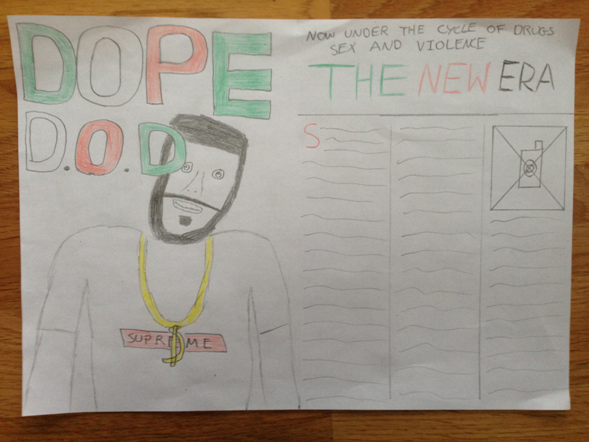
From looking at my feedback I have learnt many good qualities about my front cover which I should keep, and many bad qualities that need improving. The feedback tells me that my top banner is good and appealing to the audience meaning I should keep it how it is. They also like the colour scheme and fonts used which is good as I put a lot of work into the selection of these. However, I got a lot of ways in which I can improve my magazine. This is good as I now know what I should be doing over the next few weeks. A few people said the magazine is over crowded and feels cluttered, I will have to cut down on the information I am offering in order to solve this problem. The most popular problem was my photos and the positioning of them, overlapping and bad quality. I will have to spend time going out and taking good quality photos and then spending time editing them to improve the appearance.


