I have now completed my AS Media coursework, of creating a
professional and conventional music magazine. I hope you have enjoyed the
progression and evolution of my ideas and designs as I have created my final
product. I hope to see you next time for the creation of my music video! But
for now goodbye.
Wednesday, 7 May 2014
Tuesday, 6 May 2014
Monday, 28 April 2014
Evaluation Introduction
Now that I have completed the final cut for my
magazine I have been given the task to create an evaluation for the project.
The evaluation consists of 7 questions about how I went about the project, here
are the 7 questions:
- In
what way does your media product use, develop or challenge forms and
conventions of real media products?
- How
does your media product represent particular social groups?
- What kind of media
institutions might distribute your media product?
- Who are the main
audience for your media product?
- How do you
attract/Address your audience?
- What have you
learnt about the technologies from the process of constructing this
product?
- Looking back at the
preliminary task, what do you feel like you have learnt in the progression
from it to the final product?
Friday, 25 April 2014
Double Page Spread Final Cut

This is the final cut of
my double page spread. I have made many changes from my rough cut as I was
given many negatives and a very short amount of positives. I have changed the
whole left side of the page, using one of the photos from my third photo shoot. The photo is set in a mausoleum which reinforces
the style I am going for, 'devil of darkness'. It is also a mysterious out of
the ordinary place so it will be eye catching to the audience, who will want to
find out more about what the artists are doing they're and their bizarre personality.
I then added text to go on top of the image to give an insight into the article
and the whats going on in the photo. For the article I changed the header so it
wasn't separate from the text. I think this helps it to read more fluently and
link in better with the story. I added a quote from the article into the middle
of the page, separating the text. This automatically catches the eye of the
reader as it stands out in the green font from my house style, it then draws
the reader into the whole article as the quote is alarming and left hanging. I
have continued the colour scheme throughout the article to keep it personalized
to the artist, showing them off which is conventional of hip hop.
Thursday, 24 April 2014
Contents Page Final Cut

This is the contents page from my final cut.
Again I have kept features from my contents page rough cut and made
improvements that were suggested in my feedback and that of my own ideas. I
have kept the same header to the contents page as this was mentioned a few
times in my positive feedback. I also kept the left panel in which I had
positioned the page numbers and descriptions for all the articles in the
magazine. Another feature I kept was the reviews section at the bottom of the
left panel. I think this adds variation from the standard page numbering above
and helps it to stand out. For the editorial section under road crew I have
minimised it so only the important names are showing. I agreed with my feedback
that it took up too much space and wasn't very interesting to read. I have left
most of the page blank to allow an image dominated style, which is conventional
of rap magazines. I have used the photo that was originally on my front cover,
keeping the same effect of the artists head over the header. I have also made
it appear that he is slightly stood behind the left panel which creates an
interesting 3D effect. I kept the background white to allow the colour scheme
of the image to be the same of the contents page colour scheme. This keeps the
house style consistent and looks appealing to the reader. Finally I have
changed the fonts and language to fit that of the hip hop genre. This keeps the
magazine conventional and directly targets my audience.
Wednesday, 23 April 2014
Front Cover Final Cut

This is the final cut of my front cover for my
magazine. As you can see I have kept some features the same as my first draft,
but many features have changed due to audience, peer and teacher feedback. I
have kept the top banner and bottom banner the same due to the positive
comments I received about them, they are also conventional of a music magazine.
Another feature I have kept the same is the information about the main article
inside. Again I kept this because of the good feedback I received about it, I also
kept it because I like the fact it gives away the style of the artist through
colouring and the font type. I have kept the same photo that I decided to use
in my rap front cover rough cut as it looked conventional of the genre due to
the mise en scene of the models. I liked the setting because it gives mystery
to the artists and article because of the dark cave background behind them. I
then added in some of the features that I created for my rap rough cut. This
makes the overall design look like a hip hop magazine, especially with the new
font 'Coluna'. Finally I changed the language used in the text. This helps to
attract the target audience as they will instantly recognise it as a hip hop
magazine. Furthermore, using this distinct slang targets the audience through
synthetic personalisation by using shared deictic knowledge they can use for
diversion and personal identity.
Sunday, 20 April 2014
Improving My Article...

I have finished extending my double page spread article to fit the conventions of a professional music magazine. After looking at examples of already established designs and reading back through my research, I decided I could extend it by adding more to my interview. As I had already covered more serious topics such as the music and the description of the artists, I thought I would talk about more fun topics. I went into talk about the lives of the artists, their interests and what they get up to. This is interesting for the audience to read and offers them a chance to relate to the artist.
Wednesday, 16 April 2014
Hip Hop Front Cover Design

Sunday, 13 April 2014
Downloading New Font...

After looking into my hip hop magazine research and further established designs I have noticed they have a very distinct font type. I think this will be a key feature in making my magazine more of a distinct hip hop genre. I have used the website 'DaFont' to find and download a font similar to that used in these magazines. I will now look to use it to replace all fonts that are conventional of rock. First I have an idea of creating a mainstream hip hop rough cut front cover to learn how to use different features to create a conventional hip hop magazine. I will show you my design once I have finished.
Friday, 11 April 2014
Approaching Deadline Day...
I am now approaching the final deadline day for my music magazine. I am applying all the final changes to my final design using my feedback. I am also looking back at my initial research for ideas on how I can improve certain features that no longer work with my genre and those that were pointed out by my feedback. I won't be blogging as much as I am putting most of my attention on completing my final cut. However, I will keep you updated with big ideas and changes that I will be making to my design.
Thursday, 10 April 2014
Photo Shoot 3

I have gone out to take more photos, this time I have focused more on the mise en scene features clothing and setting. I found an old mausoleum in Seaton Delaval which has an eerie feel about it. This fits the conventions of my genre and is appealing to the viewer as it is out the ordinary. I took a range of photos here to give me options on which ones would look best on which pages of my magazine. Again I will edit these photos to give more of a professional appearance by increasing the saturation and playing with the brightness. I will also work on clearing up bad focus and helping them look more clear.
Tuesday, 8 April 2014
Photo Shoot 2

Today I went out and took photos for my magazine. I went down to Cullercoats beach where I found a range of caves, I decided to take some photos there. The dark background adds mystery to the artists and, especially in the double page spread, hint that there is more to them that meets the eye. The bottom photo is in front of the gates to a power plant. It looks like a rough area with the steel fence and worn down sign, which reflects the past of the artists lives in my article story. I will have to edit my photos to adjust the lighting and quality of colouring etc. so they look more professional and appealing to the viewer.
Sunday, 6 April 2014
Target Audience Feedback
I have asked a member of my target audience to
give me detailed feedback on my Rough Cut Front Cover, including what they like
and what can be improved.
Saturday, 5 April 2014
Teacher Feedback: Double Page Spread
Positive
- Strong layout.
- Good mix of font and colour.
Negative
- Not enough overall text.
- Opening paragraph too chunky.
- Photo doesn't really achieve much - look for examples.
- Not sure on colour scheme (green).
- Needs 3 columns in the article.
- Perhaps change the central colour green.
- The page is uneven, it needs to be half and half.
This time I have received a huge amount of negatives for my double page spread and not so many positives. The positives were the same as usual, a strong layout and good mix of font and colour. The good thing about getting a lot of negatives is I now know a lot of ways on how to improve. I need to work on my article, making sure it covers 3 columns of a consistent size. I will look back at my research to find out what a rap magazine talks about in their article so I can work on extending mine. Again I need to find a photo that looks more conventional and ambitious, however I will use it to also help my fonts. I have put a lot of work into the green font choice so I will look to create a photo with similar coloring in order to help it fit my design.
Friday, 4 April 2014
Teacher Feedback: Contents Page
Positive
-Great Layout.
-Good use of colour and font.
-Appropriate Features
-The overall look is good
- I really like the left hand side of the page.
Negatives
- Need new photos for the page.
- Still not totally genre-specific.
- Obviously need new photos.
- Needs to be more of a specific genre.
The positives were the same as the ones I got from my peers, the layout, colour scheme and fonts are good. I was also told that it had the appropriate features and the overall design is good, especially the left hand side. I will look to keep the design roughly the same when I change it to be more of a hip hop style. Again I have been told that I need more photos, I am going to put this top of my agenda to make sure it happens. The other improvement was also the same as the last, to make the genre more specific. These are clearly the two main improvements that I need to make so I will put all my focus into making them happen.
Thursday, 3 April 2014
Teacher Feedback: Front Cover
Positive
-Having a
reference to style of double page spread.
-Good layout and use of fonts.
-The overall layout is good.
-It looks conventional.
-The overall layout is good.
-It looks conventional.
Negative
-Photoshop
a bit messy.
-Plain
white background not really working.
-No clear
genre, find a style model.
-Find a more definite genre.
-Need a
stronger photo with more ambitious mise en scene.
I am happy with the positives I received for my front cover design. Again I've been told my layout and fonts are good and work well to stay conventional. However I have been given some quite difficult feedback which I must act on. Again I have been told my photos aren't good enough so I must act on these straight away, I will spend a few days developing photos. I have then been told my magazine must stick to just one genre which is going to be awkward as I have used conventions from two genres. Because my article is about two rappers I will replace all the rock conventions with that of rap. This is probably the easiest way around it as it is the genre I am strongest with and already have quite a lot of features I have taken from rap. However, I will still keep to a bit of the rock style in order to give the effect of my distinct rap type.
Wednesday, 2 April 2014
Rough Cut Feedback: Double Page Spread
Positive
Negative
-Like the layout.
-Different headings
from front cover.
-Article fills the space well. -A different setting for one of the photos.
-The layout is good. -Need page number.
-The colour scheme is good. -Page number.
-Article fills the space well. -A different setting for one of the photos.
-The layout is good. -Need page number.
-The colour scheme is good. -Page number.
-Really good overall.
-The photos are out of focus.
-Colours work well. -Pictures are a bit blurry.
-Name of the artists works well. -Photo on the right looks unconventional.
-Colours work well. -Pictures are a bit blurry.
-Name of the artists works well. -Photo on the right looks unconventional.
-Nice banner at the top.
-Please change the photos.
-Like the use of two photos.
-Photo is bad quality.
The layout and colour scheme seems to be a consistent favourite throughout my design so I will be keeping the same colour scheme and a similar layout. They also like the name of the artists and the article, this is good as it means I can focus more on the design when making improvements. I haven't been given that many pointers on how to improve, however I have had a lot of criticism for one feature. A lot of people don't like the photos as they are bad quality and maybe unconventional. I will look back at my research to help understand what a conventional hip hop photo looks like. Because I have had the same said about the front cover and contents page I will spend a lot of time taking new photos over the next few days and editing them on Photoshop. They also mentioned that I don't have page numbers, I will have to look back at my list of codes and conventions for a double page spread and make sure I include them all.
Tuesday, 1 April 2014
Rough Cut Feedback: Contents Page
Positive Negative
-Lots of
different boxes of information. -Need a few more photos.
-Full of content and no white spaces. -Some text is hard to read.
-Love layout and stories. -Can't read the black boxes to well.
-Like the use of colours and fonts. -Change white text in bottom right corner.
-Full of content and no white spaces. -Some text is hard to read.
-Love layout and stories. -Can't read the black boxes to well.
-Like the use of colours and fonts. -Change white text in bottom right corner.
-Nice layout. -Images
of different artists.
-Really nice range of colours and fonts. -Text should be slightly larger.
-Good use of different colours. -Instead of the editors have artists.
-Really nice range of colours and fonts. -Text should be slightly larger.
-Good use of different colours. -Instead of the editors have artists.
-Good layout.
-Need more photos.
Again I have been given plenty positives of my design and plenty negatives that I can use to make improvements with for my final cut. I was told that my layout is yet again good and the colours and fonts work well. This is good as it is a consistent feature that is vitally important to be appealing to my audience. To improve I was told that the most important feature were the photos, which I was already concentrating on changing anyway, the good tip was how I should change them. I was told that I should include more photos of artists, however I want to stay consistent to the hip hop genre so I may only include one photo of the main artist. Another feature was that the text is hard to read, some blamed it on the colour scheme but one said that the text just needs to be a larger font. I think this will solve the problem so I will look to rearrange the layout in order to include the one photo and larger fonts.
Monday, 31 March 2014
Rough Cut Feedback: Front Cover
Positive Negative
-Nice house style. -Need faces and '2014' not overlapped.
-Good use of different fonts. -Over crowded.
-Like the top banner, good use of fonts. -Can't read the red on white well.
-Name of magazine. -White and red hard to read.
-Good use of different fonts. -Over crowded.
-Like the top banner, good use of fonts. -Can't read the red on white well.
-Name of magazine. -White and red hard to read.
-Colour Scheme. -Put photo over 'watch out' story.
-Interesting language. -Feels cluttered.
-Lots of text and stories. -'Watch out' bit shouldn't overlap artists face.
-Interesting language. -Feels cluttered.
-Lots of text and stories. -'Watch out' bit shouldn't overlap artists face.
-Title and top banner are really good. -Too much white behind photo.
-I really like the layout. -Photo is bad quality.
From looking at my feedback I have learnt many good qualities about my front cover which I should keep, and many bad qualities that need improving. The feedback tells me that my top banner is good and appealing to the audience meaning I should keep it how it is. They also like the colour scheme and fonts used which is good as I put a lot of work into the selection of these. However, I got a lot of ways in which I can improve my magazine. This is good as I now know what I should be doing over the next few weeks. A few people said the magazine is over crowded and feels cluttered, I will have to cut down on the information I am offering in order to solve this problem. The most popular problem was my photos and the positioning of them, overlapping and bad quality. I will have to spend time going out and taking good quality photos and then spending time editing them to improve the appearance.
Sunday, 30 March 2014
The Feedback...

I have just received my feedback for my rough cut
from peers and tutors. I have been given more than enough to analyse for
possible improvements and ideas that I can then develop. I will start on the
peer feedback, but first I am going to cut it down to the most relevant, useful
and popular comments. Then I will go onto the teachers feedback, analysing each
point made and improvement suggested.
Saturday, 29 March 2014
Preparing For Feedback
Now that I have handed in my rough cuts to my peers and
tutors I will soon be receiving feedback. For my peer feedback I am going to
take note of their possible improvements, and shortlist the ideas that are most
popular and those that I find most interesting. Some of the possible
improvements might just be the ideas of that individual, meaning others won't
find it as appealing as my original design. I will take notice of all the
feedback I receive from my tutors as they know how to create a professional
magazine. Over the next week I will be analysing my feedback, getting back to
you each day on what improvements I have taken note of and how I will use
it.
Friday, 28 March 2014
Rough Cut Double Page Spread

This is the rough cut for my double page spread. The colour scheme
is different from the other pages as I have personalised it to fit the artists
on the page. I made the colour scheme of the artists similar to that of the
magazine to stop variation causing the magazine to have a colourful appearance,
which is unconventional. Instead I kept the initial colour scheme, red, black
and white, then added a dark green to make the artists unique from the
rest, which is a convention usually found in hip hop magazines. Dark green is
commonly associated with money and has connotations of ambition, greed and
jealousy, which all are conventional to the rapper stereotype. I used my style
models to notice that most music magazines use the left side of the double page
spread for the image, therefore an image dominated approach. I have followed
this approach to stay conventional, the only other feature I have used on that
page is the name of the rap duo. I have included all the text and article on the right side of
the double page spread. At the top of the page I have used a header for the
article to attract the viewer into reading it. Because I have written about new
rappers I have included an introduction paragraph to the them. I then go into
an interview, using the colour scheme, red and black, to separate the questions
from answers. Half way through the article, at the top right, I have included
another image for the double page spread. The image is similar to the other one
I have used, so I plan to use two different photos for the final cut to add
variation and make the images look individually interesting.
Thursday, 27 March 2014
Rough Cut Contents Page

This is the rough cut of my contents page. Again I have stuck to
my colour scheme of black, red and white. I have added an additional font to
this page which is conventional of the rock genre, as well as using my original
text font which is conventional of the hip hop genre. This adds variation to
the page and allowed me to style my design to both genres. I have positioned my
article page numbers down the left side of the page which I also saw being done
in hip hop magazines. However I have challenged the conventions of a hip hop
magazine and gone for the conventions of a rock magazine in terms of
graphology. I have made all the text concerning artists the same size and
haven't made any stand out over the rest which was used in the hip hop
magazines. I also have used frames for 3 images, I haven't taken the photos yet
so the photo used is just temporary so I can give you an idea of my design
idea. A hip hop magazine mainly focuses on one photo, the main artist, and
doesn't include any additional photos on the contents page. However, a rock
magazine focuses on a few of the main artists that will be featured in the
magazine on the contents page by including images of these artists. On the
right side of the page I have talked about the 'road crew' and people involved
in the editorial, contributions, publications etc. This is
conventional of both genres so I made sure that I included it on the contents
page. Finally when it came to language used I featured a lot of street slang
and aggressive adjectives and nouns. This is very conventional of a hip hop
magazine and will help to personalise the text to the idiolect of the target
audience, creating a chance for diversion.
Wednesday, 26 March 2014
Rough Cut Front Cover

This is the front cover from my rough cut.
Because my magazine is going to be created to include a mix between two genres
I have taken ideas from both Kerrang! and Vibe. For the header I have used the
font Tw Cen MT Condensed which is similar to one I saw used in a Vibe magazine,
talking about a rap artist. This convention is then reinforced by my logo which
uses a large bold font spreading across the page, this convention is consistent
in hip hop magazines. I have styled the name of the main story differently from
the rest of the page to help it stand out, this is also going to be the house
style of the rappers in the double page spread. On the right I have included
short introductions to stories inside the magazine which I also found used on
the Kerrang! front cover. However, instead of using a black background to the
text I have used white to play on the black clothing the model is wearing. At
the bottom of the page I have used another feature I saw on the front cover of
the Kerrang! magazine I researched. I have listed all the band names that will
be featured in the magazine, using the same plus sign between each name. I have
placed the photography behind all the text but in front of the title,
which again is conventional of a music magazine. This helps to create a 3D
effect with the photography, I have only covered a small amount of the logo to
make sure it is still readable. The final feature I have included is the box
dedicated to another article inside. Again I saw this feature on the front of
the Kerrang! magazine. I included an additional image in it and used a quick
description to attract people to the article. I have kept my red, white and
black colour scheme consistent throughout the front cover, except for when I
wrote about the main article. I did use 2 of my original colours to
help it blend in a bit. If I used 3 completely different colours it would cause
too much variation causing the magazine to lose its serious tone, this would be
unconventional of a rap/rock magazine.
Sunday, 23 March 2014
Photo Shoot 1

I have completed my first photo shoot for my magazine. I don't think I will use these photos for my final shoot, I wanted to have a practise for my rough cut so I could get to terms with photography. I have taken a photo for each page of the magazine and a fourth to go as an extra on my front cover. I concentrated on the costume and posture of my models, making sure the clothes and pose were conventional to the genre. I will now use Photoshop in order to edit the photos, which I have already started to do with one of them, so they will look professional in my magazine. The main tools I will be using will be saturation, brightness, magic wand tool and the spot healing brush. These all allow my photos to look a better quality and also improves the appearance of the models. I wont be bogging for the next 2 days as I am putting my full attention on the completion of my magazine rough cuts. However, I will be back to show you what I have designed.
Saturday, 22 March 2014
Writing My Own Magazine Article


I went back to look at my double
page spread introduction where I analysed an article so I could see a rough
idea of how one is constructed. After
I came to terms with this I then went back to look at my double page spread
research. Here I had made note of ways in which other magazines had use
language and information to meet conventions of the genre. I had also noted how
I would use these techniques when writing my own article. Here are a couple of
the main techniques that I learnt:
Using lexical features which promote the artists lifestyle is
suitable for the target audience as it creates a chance for personal identity
and and diversion to escape from reality.
Using slang associated
with the genre targets the demographic as this is most likely part
of their idiolect, meaning they can relate to the magazine.
I have applied both
of these techniques and theories to my article in order to create the same
result. In the top screenshot I have used an introduction paragraph which talks
about the audience. In this part I have used a more sophisticated formality in
order to reflect the intelligence and statues of the artist, using jargon and
musical knowledge. In the bottom screenshot I have written an interview with
the artist. My research shows this is a popular convention with established
magazines. It also allows me to show the personality of the artists through
language used and topics that I talk about.
Friday, 21 March 2014
Hand Drawn Design: Double Page Spread
This is the hand drawn design of my double page spread for my music magazine.
Thursday, 20 March 2014
Hand Drawn Design: Contents Page
 This is the hand drawn design of my contents page for my music magazine.
Wednesday, 19 March 2014
Hand Drawn Design: Front Cover

Tuesday, 18 March 2014
Hand Drawn Design Introduction
I am now going to design my 3 hand drawn designs for my music magazine. I am going to go back through my initial research in order to find codes and conventions from my genres to help create each design. Each design will vary, putting different ideas I have came up with from my research together. Designing each section of my magazine, front cover, contents page and double page spread, will help me experiment and evolve my idea to create my final product. I wont be doing any target audience research for this task as I feel confident with which design I am going to choose. I will now get back to you daily with each of my 3 designs.
Monday, 17 March 2014
Survey Results For Magazine Fonts


I now have my results for the final part of my magazine preparation, the fonts. Again I interviewed 20 people from my target audience, asking them which 2 fonts were their favorite. I had to ask a mass audience because of the wide range of fonts that I had shortlisted. For the header the Eras Bold ITC font just came out on top with a couple of votes. I will now use this font for all my headers and sub headers in my magazine, because it is the most appealing and best looking to the target audience. My results for my text font research showed that the target audience found the Tw Cen MT Condensed most appealing. Personally this is my favorite as well due to the fact it is condensed. This allows me to include more text in a smaller space as each word wont be spread out taking up loads of the area, it is also clear to read as well. Now that I have completed all of my magazine preparation I will go onto my hand drawn designs. I will start of with an introduction, coming to terms with how I am going to approach this task. I will then design 3 possible designs for my magazine, giving reason behind my decision for each feature I include.
Sunday, 16 March 2014
Possible Magazine Fonts

These are the fonts that I have shortlisted to show my target audience. For the headers I have used bold fonts which stand out and also stay consistant to my logo design, I used Eras Bold ITC for my logo. Bold fonts also look powerful and dominant which reinforces the stereotype of rappers, especially when their name is in that font. For the text I have chosen fonts that are thin and condensed, this makes them more clear to read when cramped together. Also using thin text exaggerates the size of the headings, reinforcing the connotations that will be in place. I will now do a quick survey like I did last time with the colour scheme. I will ask 20 of my target audience for their opinion on these fonts and get them to choose their favourite from each section. My next post will be the results from my survey, which again will be in the form of a pie chart.
Saturday, 15 March 2014
Survey Results For Colour Scheme
 I asked 20 people from my target audience which colour looked best to them. The results came in showing 14 people thought the red looked best, 4 people thought blue looked best and only 2 people liked the look of green. My original idea has came out on top, so it looks like I'll be sticking with red. I can now go onto my final stage of preparation, deciding which fonts I'll be using for my magazine. I will choose 5 possible fonts for headers and sub headers and then 5 possible fonts for my text. Again I will present these fonts, in my colour scheme, to my target audience so I can get an insight in to which they would find most appealing and conventional. I will then present my results back to you again in the form of a pie chart.
Friday, 14 March 2014
My 3 Colour Scheme Designs...


 I have recreated my final Logo design 3 times, varying the primary colour between blue, red and green. I have kept the white and black to stick to conventions and reinforce my magazine connotations. I will now present these three designs to my target audience asking which one they find most appealing. I will use a tally chart in order to keep count of votes for each design. A tally chart will be useful as I can quickly convert it into a pie chart like I did for my last target audience research. This time I won't be receiving any feedback as there isn't any need to improve my design, however I will take notice if they don't like any of the colours used. Because I don't need any feedback more people will be willing to do my survey so I can ask a wider audience to comment on my 3 designs.
Thursday, 13 March 2014
Final Logo Design

This is my final logo design for my magazine. I
have stuck to my design idea which I thought of when looking at possible
improvements in my feedback. Now I have used the colour scheme to tell the
stereotypical story of a rappers life. I used the black background to help
create the 3D effect, also black has connotations of death, evil and mystery
which relate to the actual background of most rappers. The next colour that
comes along is red which associates with war, danger, determination and
passion. This shows that even though they are in a dark place they are using
determination and passion to get out, even though they are still around war and
danger. Finally the white shows after that determination they have taken on
qualities of goodness and innocence in the life out of their 'hood'. Instead of
a red outline I have used two copies of the font and made one of them red and
the other white. I then arranged the white copy to the front so it's on top of
the red and moved it slightly to the right so some of the red is shown, which
gives the 3D effect.
Wednesday, 12 March 2014
Colour Scheme
Now that I have created my logo I need to get a final
verdict on the colour scheme. Although I am confident with my black, red and
white colour scheme I think it would be useful to get my target audiences
opinion on it. I will present the colour scheme to them giving my explanation
behind it so they can understand it. Then if they don't like it I will offer
two alternatives for them to choose from, which I will decide up now.
After researching magazine colour schemes I have learnt most
use black and white with a primary colour which stands out on the page.
Although mine already uses one, red, I think I should offer a choice of two
other primary colours and keep the black and white. If they don't like the
connotations idea behind the colour scheme then they are more bothered about
how attractive the colour scheme looks. I think the two colours most suitable
would be blue and green as they are clear to view, over colours such as yellow
and pink, and still offer a serious and sophisticated appearance.
I will now create the logo again using these colours and show my target audience. Again I will make a chart explaining which colour came out on top and I will be using for my design.
Tuesday, 11 March 2014
Survey Results and Feedback for Magazine Name...

I
now have the results from my target audience for my magazine name. The winner
is Redrum! I will now look into the feedback I received on how to improve the
design into a professional media product. I was given a compliment and an
improvement from each member of my audience. I believe receiving feedback from
my target audience instead of tutors will be more useful as I am designing it
to their interests and they do know what they want to see. Obviously each
member had different ideas on how to improve, so I analysed each idea and
decide which ones I will actually take action with. I created a shortlist of my
top 3 suggestions, I will now present the feedback and explain to you how I
will act upon their possible improvement idea.
Feedback
Target Audience 1 - "I love the way you have put 3 words together that each relate to the genre. To improve you should add an effect to the font used, so it looks more appealing on the front cover of your magazine." When analysing front covers I noticed a 3D effect was popular and used consistently throughout the page. I could use a drop shadow effect on the text so it stands out of the page and into the viewers eyesight.
Target Audience 2 - "The colour scheme stands out and they have good connotations to fit the genre. However, I don't think they go that well together so you should choose another colour." I'm happy with the connotations of red and black, and they do agree with that. To solve the problem I will add a third colour of white to my design. White has connotations of goodness, innocence and purity which all subvert the rap stereotype. However, they all link to the common story of the bad rapper, with connotations of red and black, turning to the light through their skill of rapping.
Target
Audience 3 - "The bold font really stands out on the page and works well
with the red font colour. It could be improved by including a background for
the colours to play on, this will make them stand out more." This advice has given me an idea on
how to develop my last possible improvement. I will give the logo a black
background and use white for the font with a red border. This way I can include
all the colours as well as adding a 3D effect.
Monday, 10 March 2014
Asking My Target Audience: Logo/Magazine Name
Here is a short clip of my target audience commenting on my logo designs.
Sunday, 9 March 2014
Redrum

The
third design I have created is again based on a term from my key genre, however
this time I have been more specific. The main style of hip hop I am focusing on
is Horrorcore so I have chosen a popular term found there, 'Redrum'. The noun
'red' in the name has connotations of war danger and blood which all link to
the genre of music, attracting the target audience. Redrum also includes the
word 'Drum' which is the main instrument used in a hip hop beat, most MC's just
use a drum line to put their lyrics over. The final word that has been included
is 'Rum', which is an high percentage alcohol. The rappers that I will be
focusing around will be them from a bad background, who used alcohol as an
antidepressant. Making the name relate to the contents, purpose and audience of
my magazine helps to create a specific idea on what to expect when reading the
magazine, reaching the expectations of my target demographic. I have made the
text bold so it stands out to the viewer as strong and powerful, which
reinforces the rappers mentality I will be writing about. The red font with a
thick black outline is used for the same connotations as I talked about in the
'4Real' logo design, anger and violence which are stereotyped into the street
life of early rappers.
Saturday, 8 March 2014
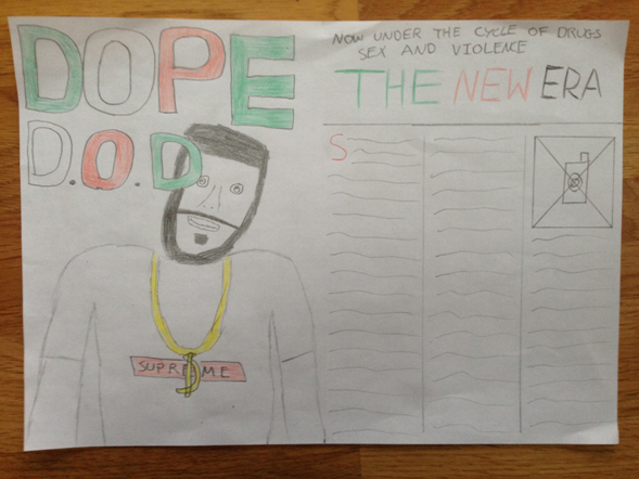
DOPE

This is my second name hand drawn design, 'DOPE'.
Instead of an O I have used a microphone. The microphone is a main feature in
rap music and has connotations of skill and lyrics, which is what rappers pride
themselves on. The target audience will see the microphone and instantly
associate it with hip hop. I have used the word 'Dope' because it is commonly
found in rap slang. This way I am directly targeting fans of rap music and they
will appreciate it as they are reading for personal identity and diversion.
This time I have stuck to a plain black colour scheme. This is to reinforce
connotations of poor and dark backgrounds many of the rappers I will be writing
about will have come from. Again the microphone shows that they used skill and
lyrics to get out of that dark place.
Friday, 7 March 2014
4Real

The name '4Real' is taken from hip hop slang
instantly relating the magazine to the genre and attracting the target
audience. I have then used. Instead of using 'For' I have used '4' to show
informality which is a convention of rap music. The word 'Real' has
connotations of quality which shows that the magazine focuses on the most
talented of rappers in the business, this is the theme that I am going for. I
have used a red and black colour scheme as they have connotations of anger and
violence, which are conventions of the rap genre. Also 2 coloured colour
schemes are consistent in music magazines, again sticking to the conventions I
have found in my research. I will use bold white writing for the text as it
works well against the black and will be more appealing for the viewer.
Finally, I have taken the use of an '!' from Kerrang! and used it for my
design. It adds emphasis on the name and makes the magazine appear as more
exciting and fun.
Thursday, 6 March 2014
Initial Name Hand Drawn Designs

I have now designed my 3 name designs which I
will present to my target audience. I have 10 potential customers ready to
choose their favourite and give feedback on how to improve it further. Around
each image I have done a few annotations explaining the purpose behind each
design to give them an idea of what I am trying to achieve. Because it is quite
difficult to read the annotations I will now explain to you, in detail, the
purpose behind each design.
Wednesday, 5 March 2014
The Next Step...
Now that I have completed my research on all 3 sections, it
is time to start designing my own music magazine. The first step is to use the
knowledge I acquired from my research to create 3 hand drawn designs. However,
before I do that I want to design the name and logo for my magazine so I know
how to create my header and make it most effective in my designs.
To start off I am going to choose the name for my magazine.
From my research I have noticed they all base their name around a convention, feature
or stereotype of the genre they write about. NME (New Musical Express) and Q
(Quality) write about the best and biggest modern music, so they use names that
reflect this. Kerrang! is an onomatopoeia, which makes sense as the rock
audience stereotype listen purely for the music so expressing it in the name
will reach the target audience. The Source don't only write about rap music but
also deliver news that would only be relevant to the main rap target audience.
Because of this they think of themselves as 'The Source' for all important news,
like hip hop shouting themselves out as the number one place to go to over
every other magazine. Vibe refers to a convention of music, although vibe isn't
just a convention of hip hop it still refers to the idea of quality music. Vibe
focus more on the most successful names in rap instead of the underground MC's,
so the name is suitable for the style of the magazine.
My initial name ideas are:
- 4Real
- DOPE
- Redrum
I will now create hand drawn designs for each name so I can undertake a short survey with my target audience. I will also listen to feedback on my winning design so I can make final changes for my magazine design.
Tuesday, 4 March 2014
XXL Double Page Spread Research

*I struggled to find a Vibe double page spread of good quality in which I can study, so instead I have chosen to study another of their biggest rivals, XXL. The double page spread will still help me to understand codes and conventions that are used in a hip top double page spread.*
The XXL double page spread I have chosen to study is written
about the 'old school' infamous rapper, Nas. In the image he is wearing a
watch, chain, diamond ring and a vest. These all carry connotations of prestige
and wealth. In addition, Nas is revelling his tattoos on his arm, which is a
common theme amongst urban street culture which reflects his statues of being a
street rapper who prides himself on his urban background stereotype and image. I will have to use costume in order to reflect the rappers
story and reveal features from his background as well as show off the position
they are at now. This is done in the photography by using temporary items,
watch, ring, chain, to show luxury which is only recent in his life and permanent
details, tattoo, to show that there are still elements from his past that are
still with him. My magazine could use this as this is the character profile my
artist will have. The use of props is evident in the background with
various gym equipment including Everlast punch bags, gym mats and weight
machines. These pieces of equipment, for example the punching bag, carry
connotations of training to fight. This is significant as it may reflect that
Nas is preparing for a battle with his career, or against another rapper, which
is conventional with rap as rappers see it as one big competition to be the
best. Relating to conventions of the genre I am
portraying will be vital when meeting the demands of my target audience. I will
use props that stand out in my images to reflect the story being told and catch
the eye of the reader. If the photography doesn't meet the expectations of the
target audience they won't believe the story will be any better. The
setting appears to be a dreary, old fashioned gym with windows looking out to
the city Nas prides himself for being brought up in. Again this backs up the
convention of raps battling to be top of the game, reflecting his 'Rags to
Riches' background. The image has a lack of lighting on the left side of the
rappers face and body , creating a dark and ambiguous side to his life which
may be spoke about in the story. The setting of the
photography plays a big role in presenting the style and characteristics of the
artist. I will have to spend time searching for a location in which I can take
my photography. I will then edit my photos to play around with the lighting and
colouring to help reinforce the stereotype I am presenting. The most
dominant text on the screen appears to be the artists name, Nas. The font used
is old fashioned, carrying connotations of elegance and class which provides
the reader a positive image of the rapper. It may also suggest XXL magazine is
one of class and provides stories and news that people would not usually stereotype
with rap. As I am slightly challenging some conventions
of a rap magazine I will have to do the same. I will use conventions that are
most appealing and important in rap magazines, but then include features that fit my own
personal style.
Monday, 3 March 2014
The Source Double Page Spread Research

I have found a double page spread from The Source Magazine
which is written about the rapper Rick Ross. They use a simple black and white
colour scheme, although it isn't colourful it still stands out effectively as
it matches the tuxedo Rick Ross is wearing. This reflects the lifestyle of the
artist, rich and classy, a colourful colour scheme would not suit the
personality of the rapper. After I take my photos I
will experiment on them by changing the hue on the clothing worn to match the
colour scheme of my magazine, and seeing which ones offer the same effect as
this double page spread. This will ensure that my magazine fits the style of my
artist, again relating to the target audience for personalisation and diversion.
I like the way Rick Ross has been positioned on one side of the page and
the text on the other. Not only does it make the text clearer to read, it makes
him appear dominate on the page which is a quality of Rick Ross and rap of
being the best in the business. Again I will follow
this convention as this is what the audience of rap music will be expecting to
see. Making sure it fits the requirements of the target audience is essential
as they will be reading the magazine for personal identity and diversion to
escape from reality and into the dream world of the rapper. I think the
way a bold drop capital has been used is effective as it fits the qualities of
Rick Ross, big and powerful. Also the introduction paragraph is a feature which
is also very effective as it gives the reader a basic idea of what the article is
going to be about. The quote 'You ain't seen nothing yet' has been used as a
short sentence that grabs the reader's attention and urges them to see more.
Also the slang 'Ain't' gives the reader an idea of the artists idiolect and
maybe targets younger age groups (16+). The phrase, 'He arrested speakers
nationwide', relates to the rapper stereotype of violence and lawlessness,
however it subverts where Rick Ross is doing the 'Arresting'. What makes this
quote clever for Rick Ross fans is the fact Rick Ross was once a corrections
officer, again personalising the article to the target audience. When considering the language styles for my double page
spread I will have to think into what will fit into the magazine effectively,
as well as what will seem realistic in relation to the artist. Personalising language
features to the target audience will also help fit the conventions of a successful
magazine. Not only will it be understood by new readers, but have qualities
aimed at the fans making them feel special in contrast. Rick Ross is
dressed in a smart black suit which presents him as being someone of power and
class. The way he is casually holding a champagne glass and lifting his head
high, not looking towards the camera, demonstrates his wealth and masculinity. I
think the use of props, balloons, champagne, sunglasses, expensive suits and jewellery
reinforces his dominance in the music industry and defiantly portrays the high
life that he lives. When taking the photos of my model,
I don't want to challenge the conventions of clothing too much as the qualities
of my artist won't be the high life, but the opposite side of rap involved
around hoods and grit. I have to make my styling realistic to the artist so I
will be using clothing such as hoody's and caps. This way I will expect people
who are more interested in hip hop to be more intrigued to read the article.
Subscribe to:
Comments (Atom)